A week of art
that moves you.
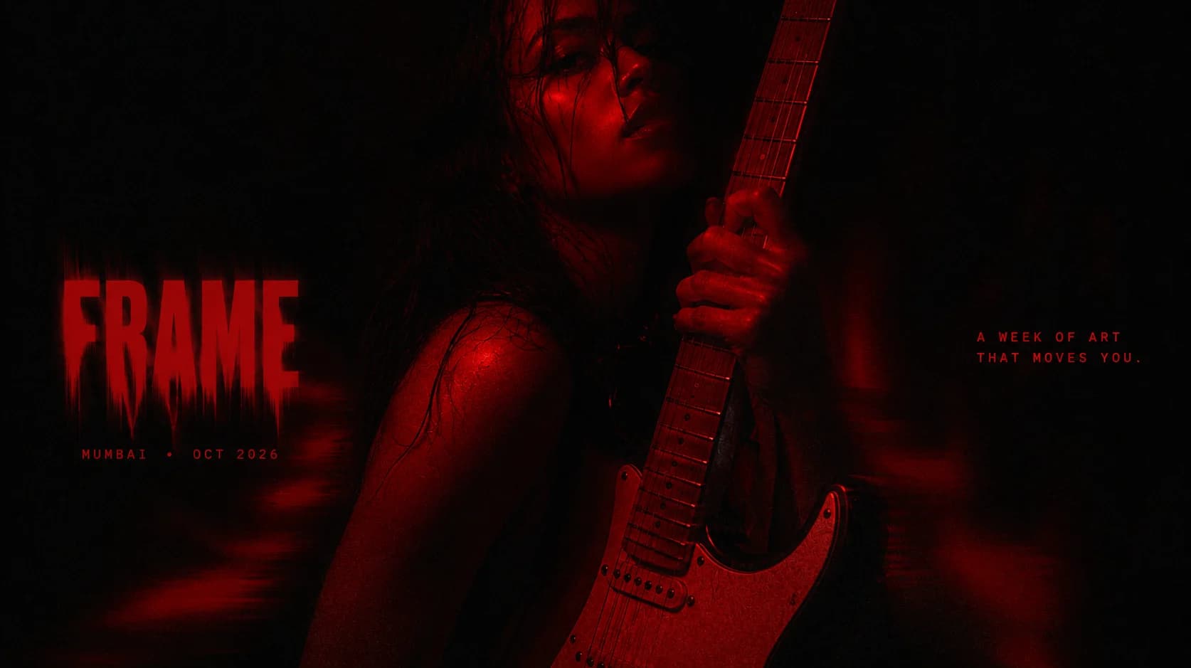
An annual gathering for contemporary culture needed an identity equal to the art it platforms.
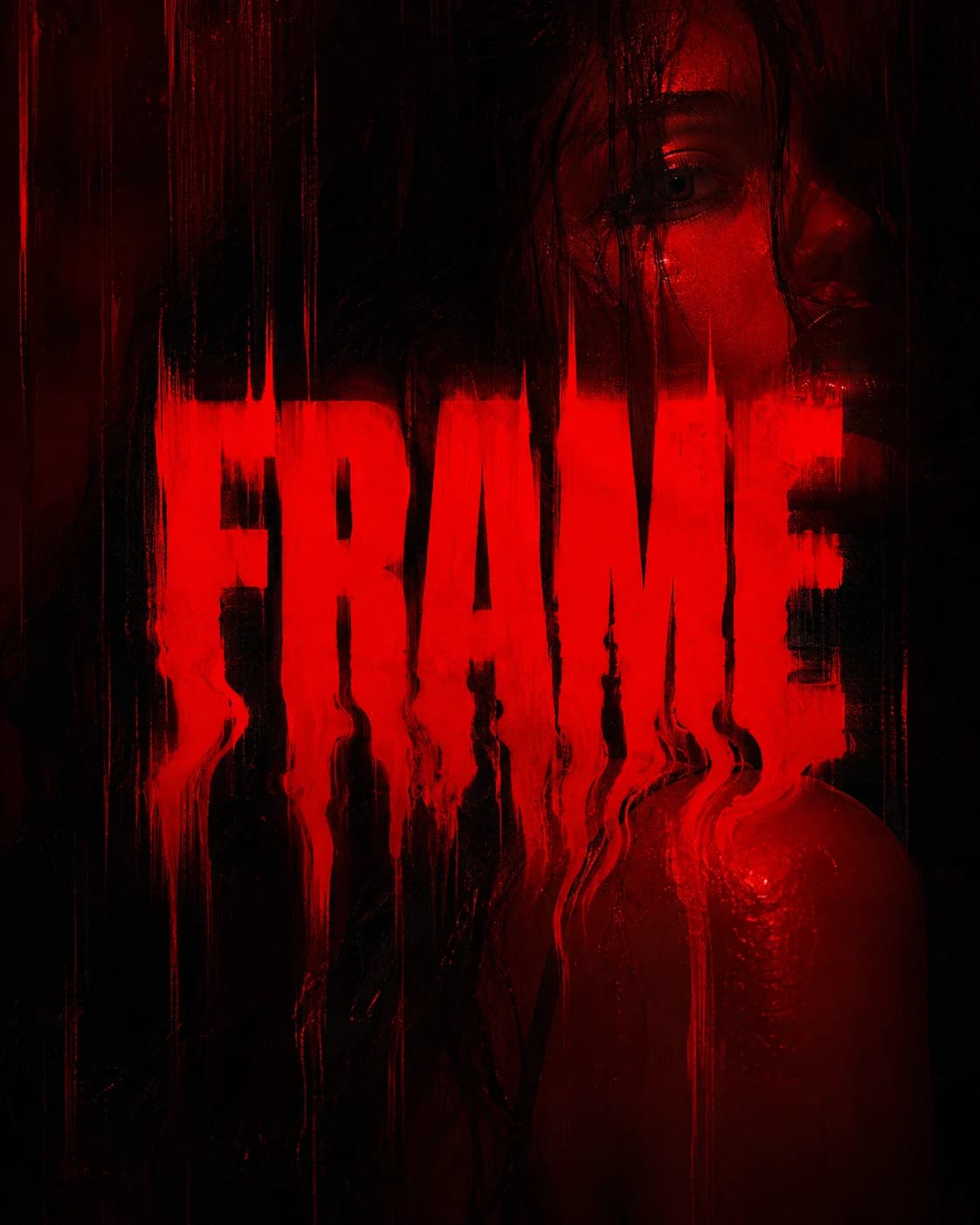
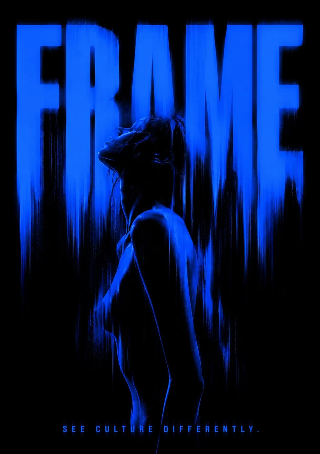
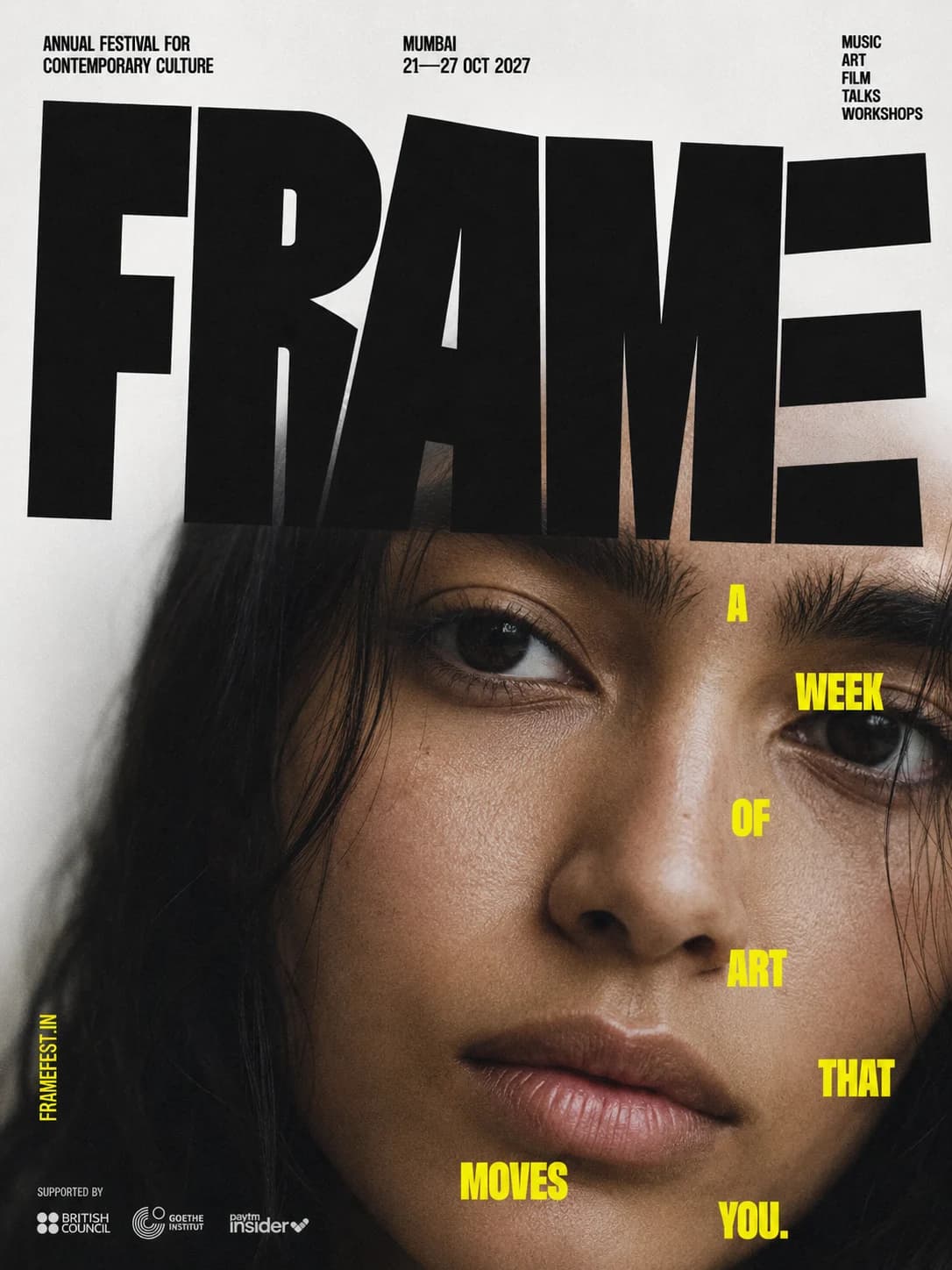
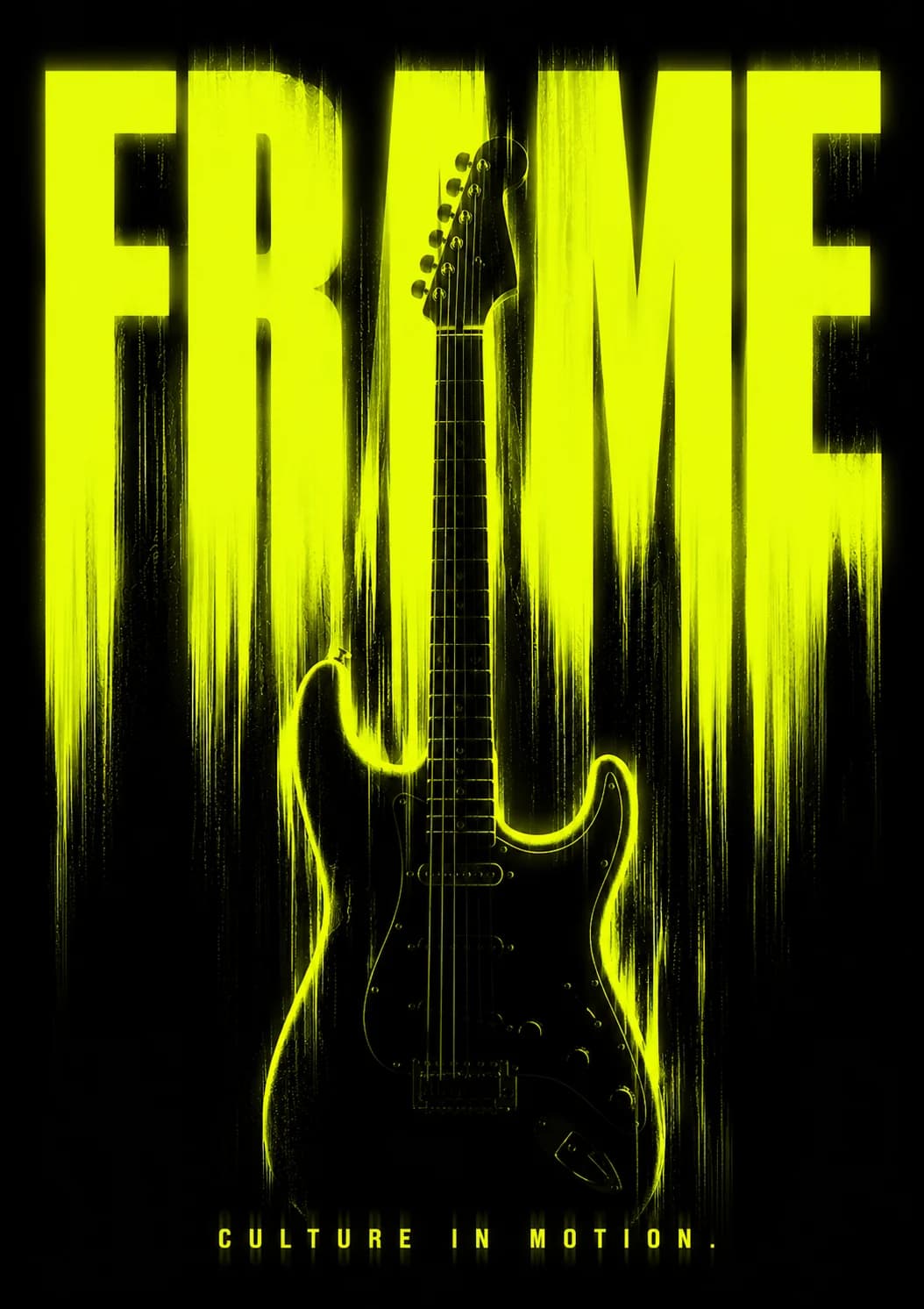
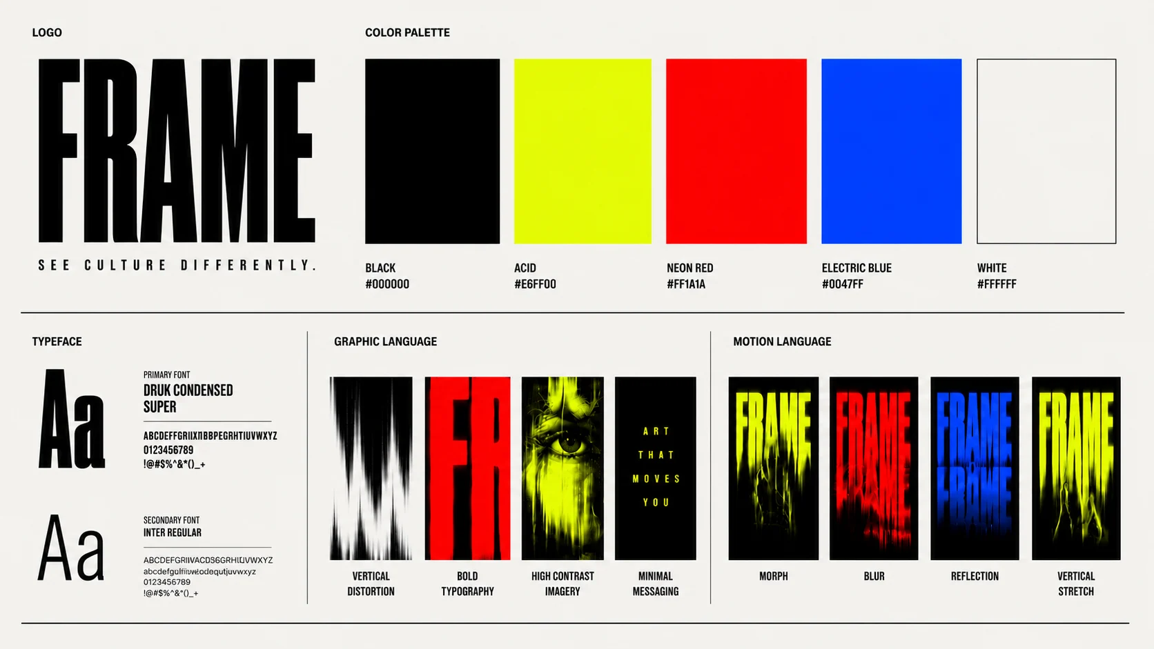
We built the full system.
Key art, type, colour and campaign language, all from one set of rules — a structure disciplined enough to sit beside any artist’s work, and confident enough to carry the festival’s name alone.
Making seven days of art feel like one unmissable event.
FRAME is an annual festival of contemporary art — a week of exhibitions, performances, screenings and late-night talks that takes over galleries, warehouses and public spaces across the city. It isn’t organised around a single medium or movement; it’s organised around a feeling. Work that moves you, gathered in one place, for seven days only.
That breadth is the festival’s greatest strength, and its hardest design problem. A programme this varied — painting beside sound installation beside experimental film — usually ends up with one of two identities: a polite, neutral system that disappears behind the art, or a loud graphic gesture that competes with it. FRAME deserved neither. It needed an identity confident enough to carry the festival’s name on a poster with nothing else on it, and disciplined enough to sit next to any artist’s work without arguing.
Our answer was to treat the identity the way the festival treats the city: as a structure things happen inside. Everything in the system is built from that idea — a rigid typographic grid, a headline sans cut close and heavy, and mono-spaced captions that behave like wall labels, ready to hold any artist, any medium, any year.
Colour does the emotional work. The system lives almost entirely in black and white — the neutral gallery wall — with a single burning red reserved for the festival itself. Wherever FRAME appears, the red appears; everything around it stays quiet. Repeated across a poster wall or a feed, that restraint becomes the loudest thing in the room: one signal, insisted on until the city knows it.
The system was designed to flex before it was designed to look good. The same rules produce a key-art poster, a wayfinding banner, a ticket, a story and a title card — which meant the ’26 campaign could be produced quickly, by many hands, without ever drifting off-brand.
The result is an identity that behaves like the festival it announces: structured, a little severe, and electric at the centre. Seven days. One red. The work does the rest.
[ concept ]
FRAME '26 is a self-initiated brand concept by Public Access™ — not a commissioned project, and not affiliated with, endorsed by, or connected to any existing company, product or organisation of the same or a similar name. All marks shown are our own.