Steeped
in layers.
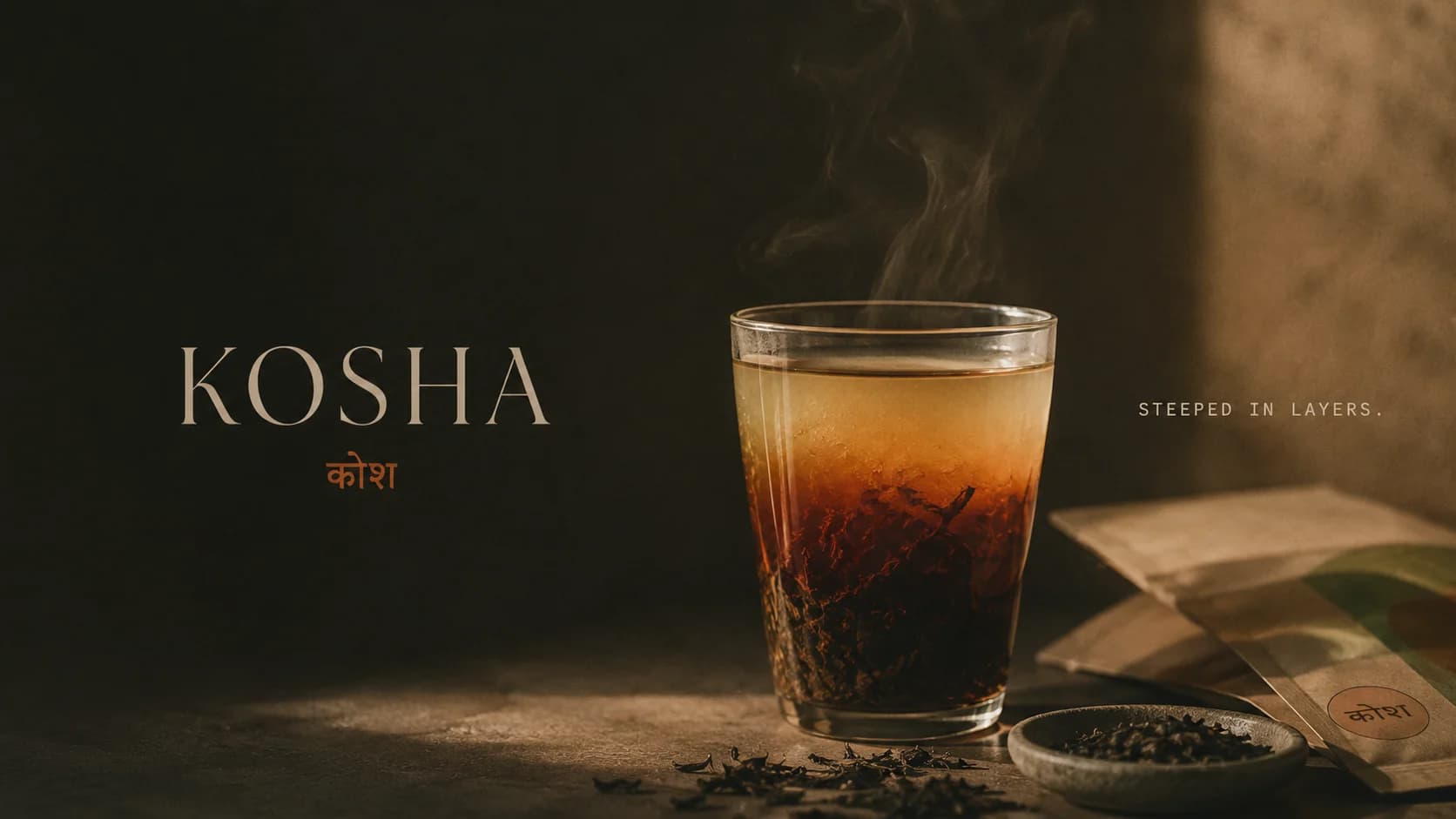
A tea atelier built on slowness — single-origin leaves that reveal themselves in layers.
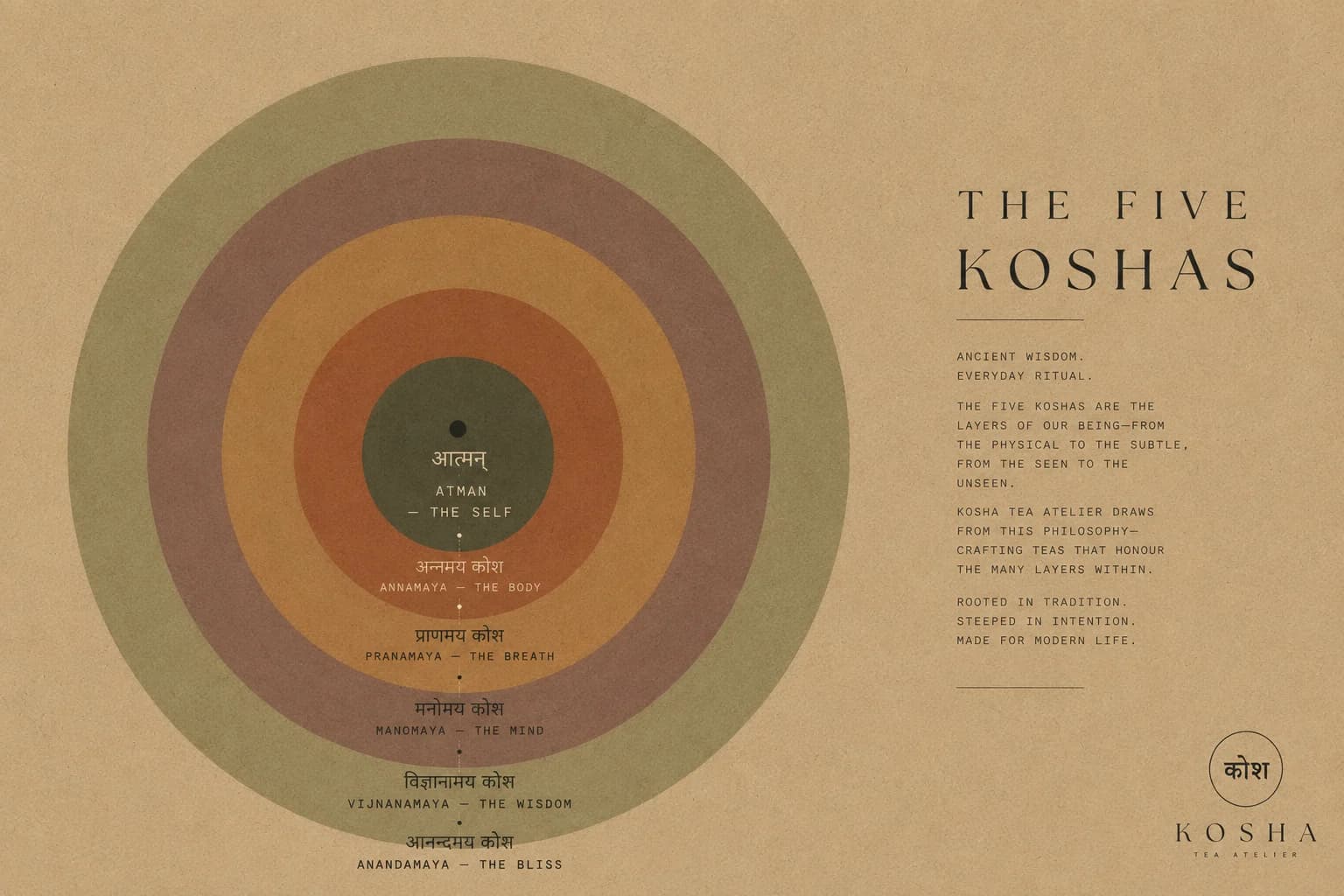
Five sheaths became nested rings, then a single circle — a boundary quiet enough to hold everything within.
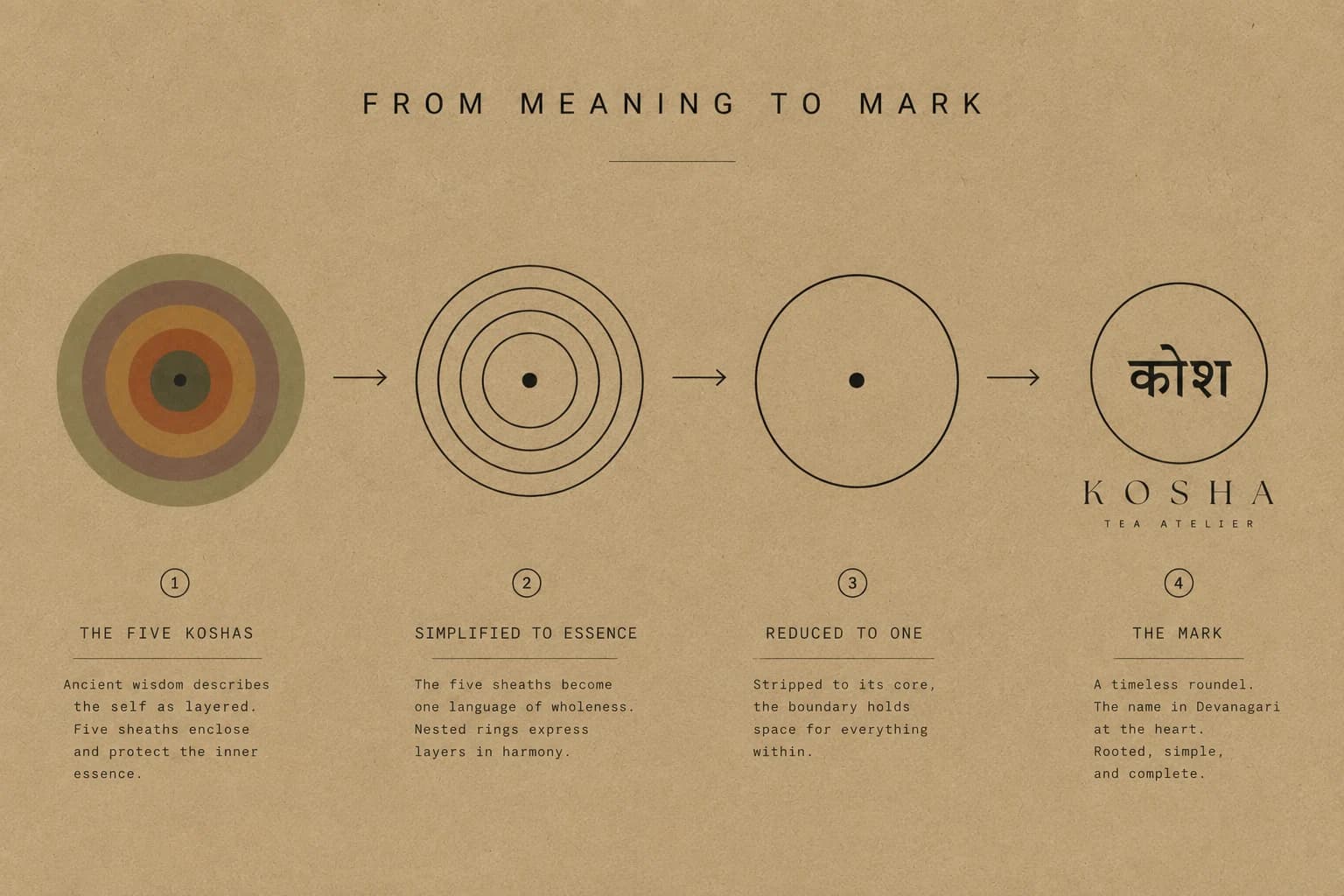
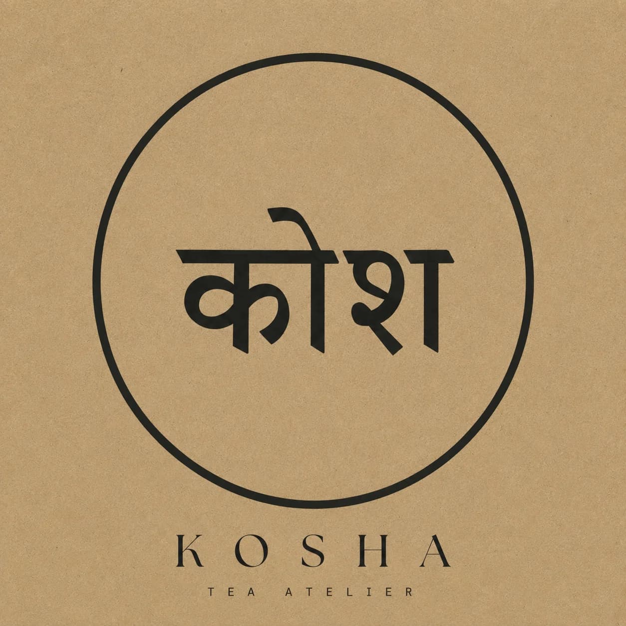
One circle, holding the name in Devanagari.
कोश sits at the centre of a single unbroken ring — the last of the five sheaths reduced to one boundary. It is the only element that never changes across the range: the colour moves, the variety moves, the roundel does not. On a tin it is stamped small enough to find rather than to be shown, which is the restraint the whole system runs on.
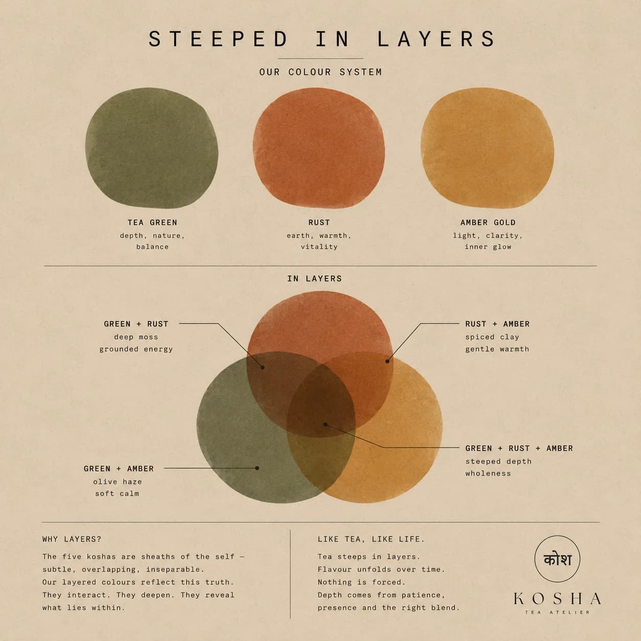
Colour steeps like tea. Three earthen inks that deepen where they meet — depth from patience, not force.
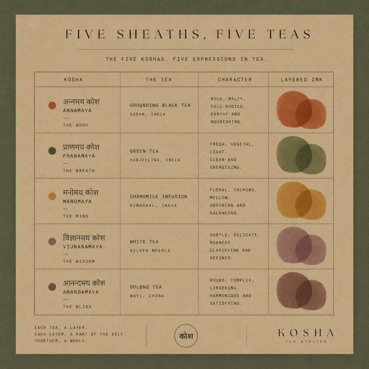
Every tea is one layer of the self — the same system, five expressions.
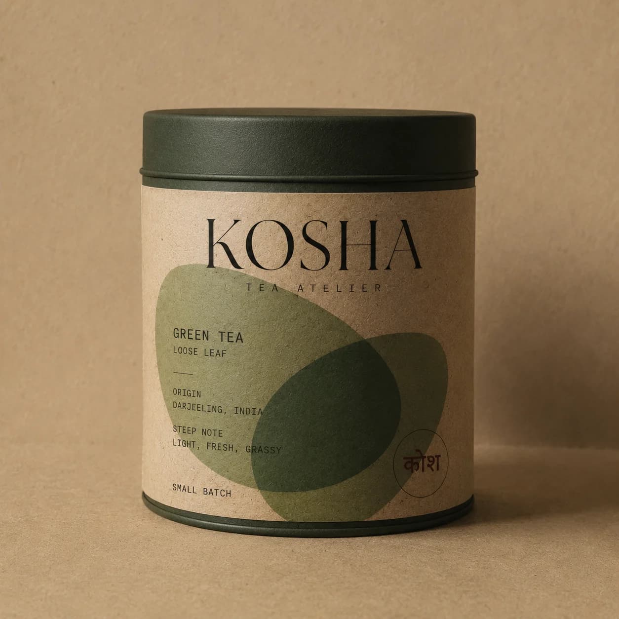
Kraft paper, a matte lid, one steeped colour.
Every package carries the same layout — the serif wordmark, the कोश stamp, and a single translucent colour-field that names the variety without a label ever having to shout. The system holds across tins and pouches, so the whole range reads as one family on the shelf.
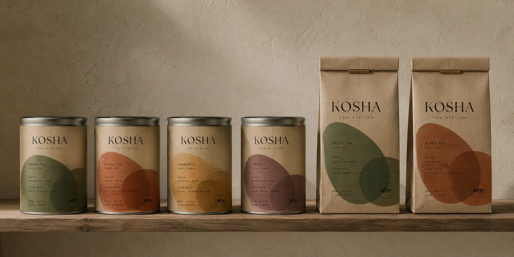
A tea you uncover, not just drink.
KOSHA is a small-batch tea atelier built on the idea that tea is something you reveal in layers. The name comes from the Sanskrit kosha — a sheath, one of the five coverings the self is wrapped in, from the physical to the subtle. It runs through everything: single-origin leaves in small lots, steeped slowly, opening a little at a time.
The brief was quiet but hard. Premium tea is a crowded shelf of two clichés — heritage gold-and-maroon that looks like everyone else, or minimal apothecary white that says nothing at all. KOSHA needed to feel rooted in a genuine idea and modern enough to sit in a design-led kitchen, without leaning on either stereotype.
The philosophy gave us the whole system. Five sheaths reduce to nested rings, and nested rings reduce to a single circle — the roundel that holds the name in Devanagari at its centre, rooted and complete. It is the mark, and it is also the argument: a boundary that makes room for what’s within.
Colour carries the meaning the way steeping does. Three earthen inks — tea green, rust and amber-gold — layer and deepen where they overlap, so each variety gets its own tone and the blends between them feel inevitable rather than decorative. Every tea maps to a kosha: a grounding black for the body, a clarifying green for the breath, a calming chamomile for the mind. The concept becomes the range.
The result is packaging that behaves like the tea inside it — patient, layered, and honest about where it comes from. Nothing forced. Depth from patience, presence, and the right blend.
[ concept ]
KOSHA is a self-initiated brand concept by Public Access™ — not a commissioned project, and not affiliated with, endorsed by, or connected to any existing company, product or organisation of the same or a similar name. All marks shown are our own.