Take the leap.
Make your own.
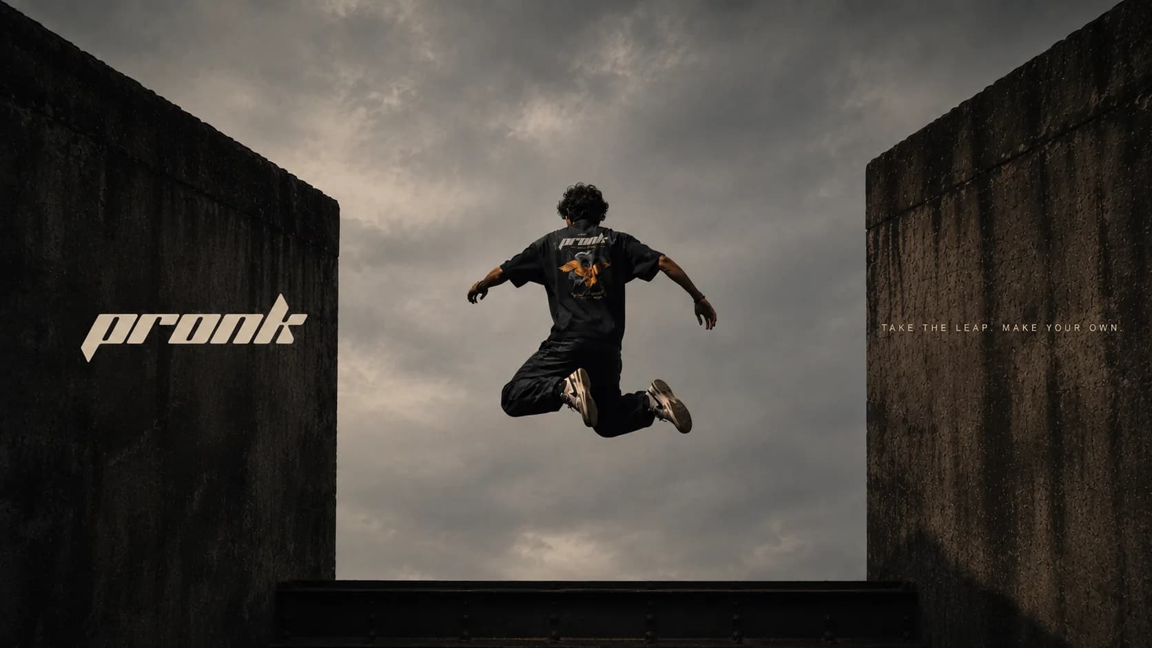
A movement label for people who read the city as terrain — named after the leap an animal makes for no reason but the joy of it.
Every letter is cut on the same slant, so the word is already moving before you read it.
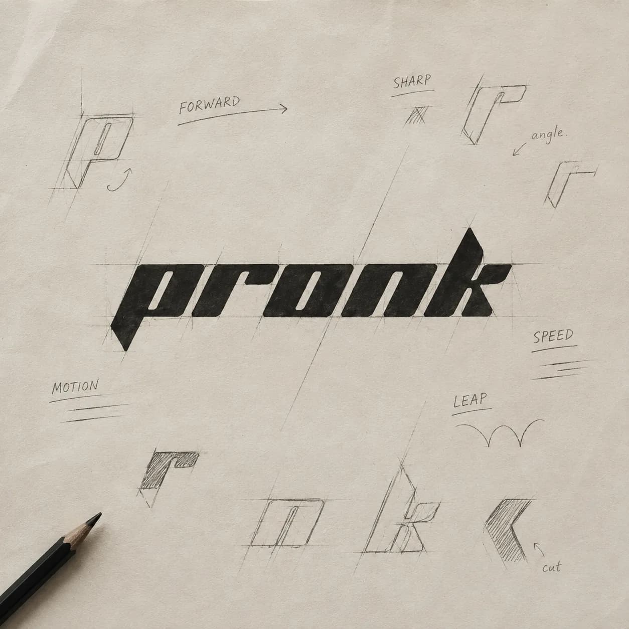
The mark had to survive a wash, a wall and a bad landing — so it was built for the places it would get scuffed.
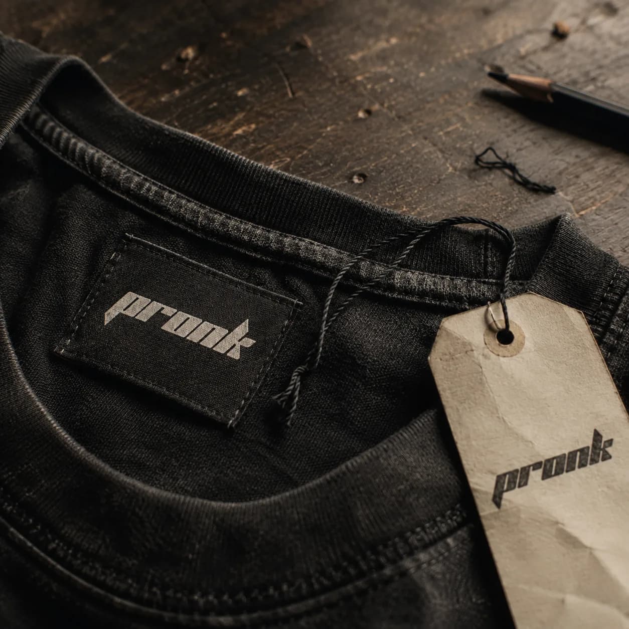
Woven at the neck, stamped on kraft, printed at the back.
One logotype, three substrates, no redraw. The woven label keeps the cut angles legible at twenty millimetres; the hang tag lets the paper take the ink and the creases; the garment print is set large enough to still read once the black has washed down to grey. A mark that only works pristine is no use on clothes people actually wreck.
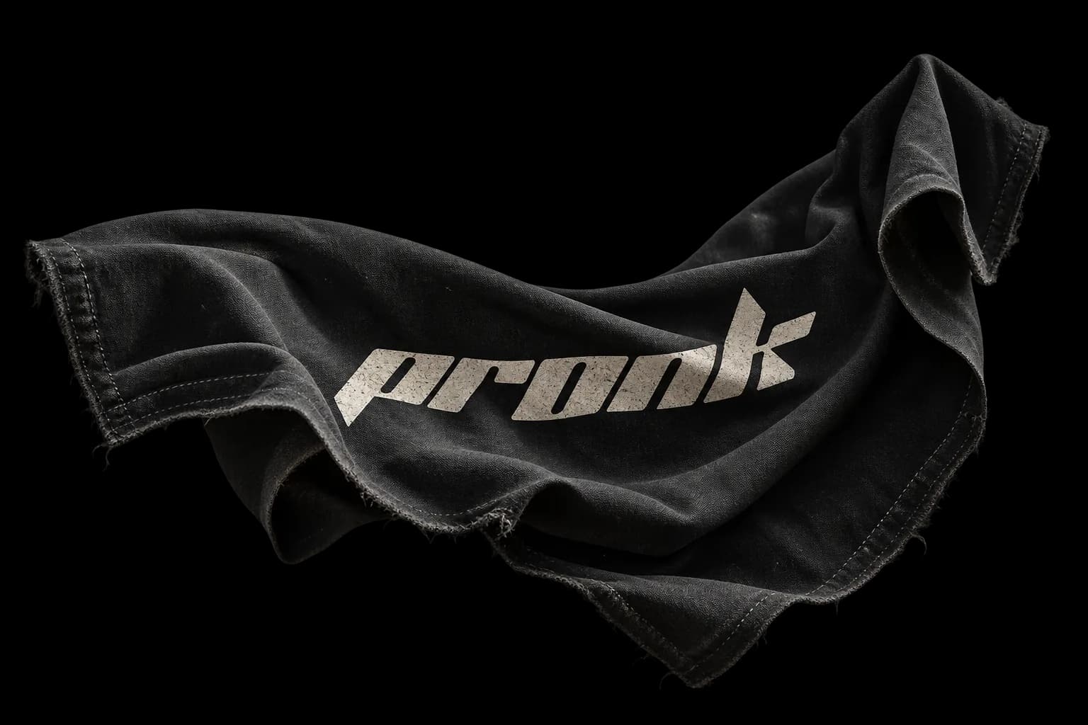
Washed black, raw hem, the logotype fading at the same rate as the cloth.
A word for jumping because you can.
A pronk is a real gait — the stiff-legged, four-footed leap a springbok makes when nothing is chasing it. Biologists still argue about why. The most convincing answer is that it is a display: proof of what the body can do, performed for its own sake. That is the whole brand in one word, which is why it is the name.
PRONK is a movement label built around parkour and free running — a discipline with a real image problem. Its visual language has been stuck for two decades between energy-drink extremity and GoPro sports-tech: chrome gradients, italic screaming, the aesthetics of a dare. None of that describes what the practice actually feels like from the inside, which is closer to reading a building carefully and then trusting yourself.
So the identity is built on restraint carrying speed. The logotype is drawn on one consistent slant with every terminal cut flat on that same angle — no curves, no italic fakery, just letterforms sheared as if by the motion itself. The counters stay open so it holds at label size. Sketched by hand first, because the angle had to be found by drawing rather than by a slider.
The palette is what the city already is: washed black, concrete grey, and a bone that reads as chalk on a wall. No accent colour. The only warmth in the whole system comes from kraft paper and worn cotton, which are materials rather than decisions.
The garment is where the brand is judged, so it was designed to age. Everything is specified on washed black with a raw hem, and the print is scaled and weighted to degrade at the same rate as the cloth around it. The tee is not merchandise for the label — it is the label. Take the leap, make your own.
[ concept ]
PRONK is a self-initiated brand concept by Public Access™ — not a commissioned project, and not affiliated with, endorsed by, or connected to any existing company, product or organisation of the same or a similar name. All marks shown are our own.